Just like an aircraft needs a suitable landing strip to land, a successful web marketing campaign isn’t complete without a landing page of its own.
You want your visitor to land carefully, naturally, and methodically on a landing page that exemplifies your sales funnel.
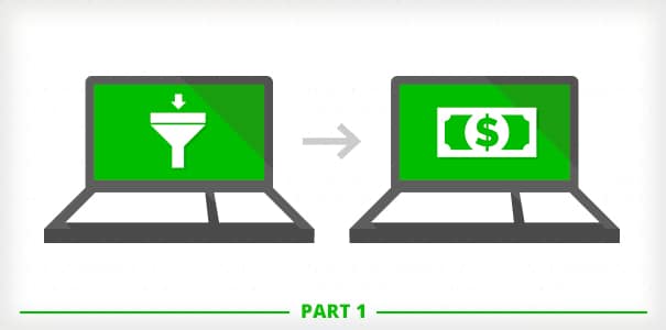
Remember, your landing is there to serve as the entry point into that funnel.
Back to the aviation metaphor for a second, what differentiates and separates an aviation runway landing from a marketing one—is a “one size fits all” approach may work for planes of various sizes, but it most certainly does not work for all types of campaigns.
And this my friends is where the aviation metaphor ends.
Each of your campaigns should have a dedicated landing specific to the campaign at hand, whether that’s using one of the ones we made and provided for you at CrakRevenue, or whether that’s building your own.
But what kind of features should your ideal landing page have?
Today, let’s take a deeper look at the main components of a successful landing page in the adult industry.
First, Identify the Type of Landing Page You Need
To do this, circle back to the first thing that inspired you to start the campaign.
In other words, what’s the goal of your campaign?
Whatever this goal, it usually falls into one of these two main types of landing pages:
The Lead Generation Landing Page
This is typically the kind of landing page you’d want for establishing and building an adult audience.
This kind of page exists to collect traffic details - most often emails - in exchange for something - usually free content.
In a nutshell, this kind of lander would exist solely to create leads (or so you could obtain the contact addresses of interested users you would hope to convert later on).
The Click-Through Landing Page
A Click-through landing page (sometimes referred to as a Jump Page) is your typical funnel-style landing that routes traffic to your designated final destination -- the end of the funnel where you’re hoping the magic happens … and your visitor converts.
The purpose of a Click-through lander is to of course put the feelers out and start convincing your visitors before presenting them with the offer or product you’re trying to sell.
How to Recognize a Landing PageNot all landers will look the same, but what all landing pages have in common are these distinctive characteristics:
|
The Universal Components of a Successful Landing Page
Whatever the type of landing page you’re building, there are a few things you need to take into account if you want to reach your goal.
1 - NAIL Your Selling Point
What are you selling?
This point needs to be established, settled, and clear right from the start.
In fact, there are a few page structuring elements that can help you nail the selling point (the 4 elements include a main title headline, subtitle, reinforcement statement, and a closing argument).
The main title of your landing should present the product and entice the visitor to learn more about it. You have only one shot at making a good impression from the start.
The sub-title clarifies and adds to the previous information you provided in the first (main) title. This is usually a support phrase that includes a persuasion point to entice the user to do something.
And finally, the first component of a successful lander isn’t complete without a reinforcement phrase or closing argument.
The reinforcement phrase allows you to circle back to the purpose of the landing page and the closing argument is like a “last ditch effort” to communicate the perks of your offering before your visitor moves further down the page.
2 - The Hero Shot
This component can either stand for or complement the reinforcement phrase we covered earlier. It’s there to highlight the user benefits of using said product in an easy-to-absorb context.
The best Hero Shots are definitely ones featuring media - the most efficient being video.
Indeed, our own stats at CrakRevenue tell us that our landing pages featuring video have a much higher conversion rate than those without.
3 - Make the Benefits Known
This is the point in your lander where you list ALL the advantages to your offering, ideally in short, bullet-like statements.
Something reminding the user of the benefits ahead — or even pointing out what it is that they simply cannot do if they don't perform the action you want them to take.
We suppose if you wanted to detail them in multiple paragraphs to reinforce your point you could -- but it should add value, and the clear and concise approach is generally recommended.
4 - The Proof; Satisfaction Signals!
This part is often underestimated yet it’s crucial since more than two thirds of consumers are influenced by online reviews. There are two main ways to illustrate proof & satisfaction behind all the benefits you mentioned above:
- Social proof: The most common being comments and reviews.
- Social trust: This is where you would show some statistics in your favor such as “98% satisfied customers...” or “95% of our users recommend it!” etc.
5 - The Call-to-Action
The last component we’re going to talk about (and arguably one of the most important elements any successful landing page can have) is the CTA — the all-too-familiar Call-to-Action.
It’s that text behind a button or link that urges and instructs your visitor to do something.
It’s the text that leads your user towards a conversion.
In other words, your CTA really needs to be efficient to get the job done.
And what’s the best way to achieve that? Be direct, incentive, and short while truthfully describing what will happen if your visitor clicks!
Call-to-Action examples you’re sure to have seen:
- “Click Here!”
- “Read More”
- “Create My Account”
Yep, it’s pretty difficult to surf the web without seeing a CTA just about everywhere you look.
It’s a good thing though… it should emphasize the importance of this instructive little piece of text.
Call-to-Actions wouldn’t be everywhere if they didn’t work!
So, make sure yours is perfect.
The devil is in the detail
Today, we gave you an overall idea of the type of landing page you should be aiming for and the different components it helps to include.
However, having these components alone doesn’t guarantee success.
There are additional key elements to every landing page that you should approach with care.
Next week, we’ll be expanding on this in greater detail so you can ensure that your dedicated landing will not fall short in generating you more conversions - and consequently - more revenue.
Stay tuned!