You might have noticed we recently launched our exclusive MyFreeCams widget for affiliates.
Today, we’d like to take you for a behind-the-scenes tour of our testing process so you can better understand how we managed to deliver a cutting-edge solution for everyone.
After all, you probably don’t have access to a mathematician and crazy statistical models at the core of such a wild experiment. Psst, that’s why being part of a CPA network is worth it: we have experts working full-time on specific goals so you can focus on promoting offers and their optimized sales funnels.
But it’s not really about us either: we’re sharing intel so that you can create your own tests, iterate and find a winning formula. These cam insights can be applied to lots of verticals as the processes are usually pretty similar in nature.
The importance of heat maps
Part of our testing included a thorough heatmap analysis so we could understand user behavior once they landed on our page — in this case, the “Big Thumbs Video” landing page for Desktop.
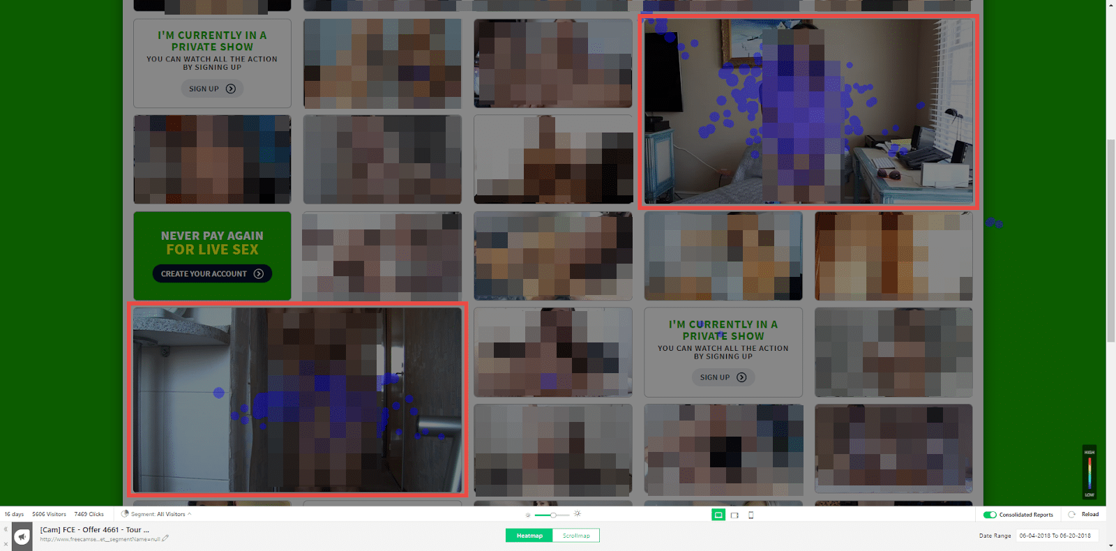
As you can see with the image above, we quickly came to the conclusion that our 3 big video thumbnails were accounting for a majority of the 7,000+ clicks during our 12-day long test.
This isn’t all that surprising since Fitt’s law taught us that bigger and closer targets are easier to reach. Naturally, they also attract more clicks in web design. Your ads (in this case of our thumbnails) need to be close enough to each other — so don’t be afraid to enlarge your clicking areas, too.
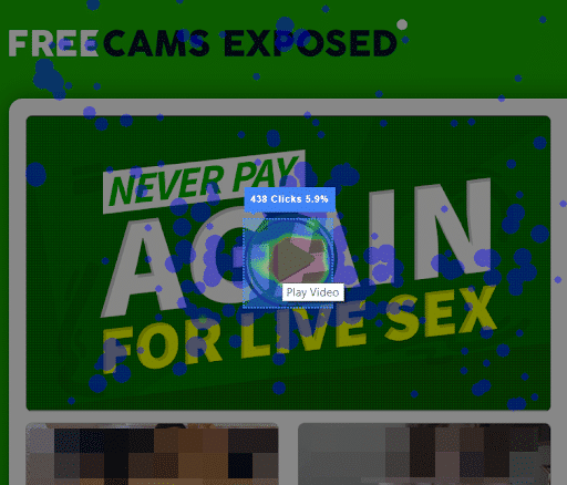
Further analysis of the MyFreeCams/FreeCams Exposed landing page revealed that our play button for video playback was 9 times more clicked than the frame itself — 5.9% (438 clicks) vs. 0.6% (48 clicks).
Users love to feel in control and the play button encapsulates such an idea. We increased its size to make sure we weren’t losing any clicks.
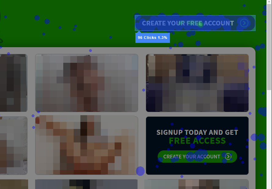
Another insight came from the account creation button at the top right of the landing page. We noticed it received 7 times more clicks than the one at the bottom of the page: 96 clicks (1.3%) vs. 0.2% (14 clicks). We decided to create a bigger account creation thumbnail to drive more clicks to our call-to-action and make it pop.
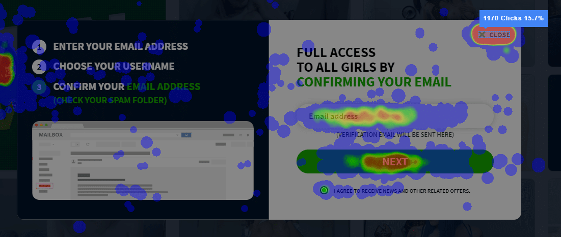
Once users made it through our subscription form pop-up, heat maps allowed us to see how the Next button wasn’t the most clicked — something we needed to fix. In fact, the majority of clicks were done on the ‘close’ tab with 1170 clicks (15.7%).
Such cam insights pushed us to move the close button outside of the form to make it less of a focal point.
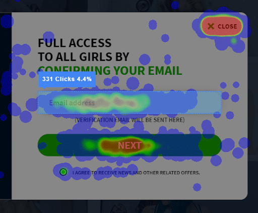
Still on the form, we noticed there might be a potential loss of users between our email address text field and its 331 clicks (4.4%) and the next button with its 419 clicks (5.6%). In-between are 88 clicks (1.2%) that weren't really accounted for, so as part of our tweaking we decided to let people click on the next button without entering their email addresses.
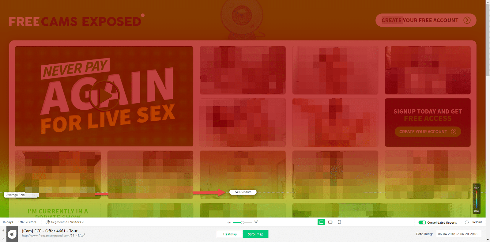
Above the fold content is one of web design’s best practices and is pretty much essential to master.
The definition has certainly evolved a lot over the years, especially in this golden age of fast Internet. We no longer have to deal with an overwhelming number of slow Internet connections where users would rarely scroll all the way down a page due to the site’s insane loading time. Needless to say, you still need to be attractive right off the bat.
The screenshot above reveals how most visitors (74%) ended up in the average fold: in this case, 752 pixels. We asked ourselves if there was a possibility to maybe shrink the display so visitors would see more content without having to scroll down. This might seem easy, but above the fold placement requires lots of work because you need to think about desktop, mobile, different browsers, screen resolutions and more.
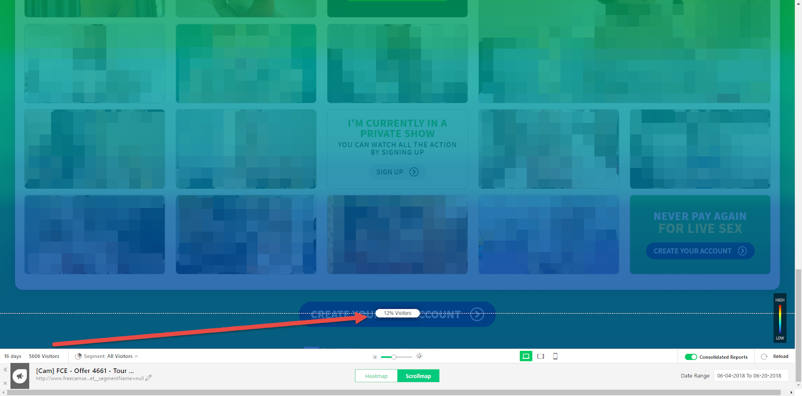
Indeed, only 673 visitors (12%) made their way to the bottom of the page. Since we also had a call-to-action button there, we started brainstorming new ideas to make it more interesting and rewarding for users to reach this area. We ended up adding arrows which helped users navigate the landing page.
Essential A/B Testing lessons
Our goal behind the MyFreeCams widget—and every lander of ours since day one—has always been to give affiliates and webmasters the tools WE wish we had available ourselves as affiliates just starting out - or as affiliates at any stage of the spectrum, really.
We set out to make tools that are not just awesome, but tools that have the best shot at making both you and us money—and flush with conversions—at the end of the day.
The way all partnerships should work, dontcha think?
That’s the bottom line.
Heat maps helped us tremendously in achieving this goal. Combined with A/B testing, we really started to get tangible results.
Here’s the complete breakdown of some testing we did with MFC banners. We wanted to create a test campaign to identify 5 profiles with the highest click-through rate (CTR) that our in-house Media Buyers could use for their marketing.
First Stage
Great experiments always start with a clear hypothesis. For the first stage, we estimated there’s a strong variation of CTR and EPM with different types of camgirls.
We targeted the United States with a 315x300 iFrame from the powerful performance tracker Voluum. We chose to test on Desktop with 25 unique profiles overfor a 10-day period.
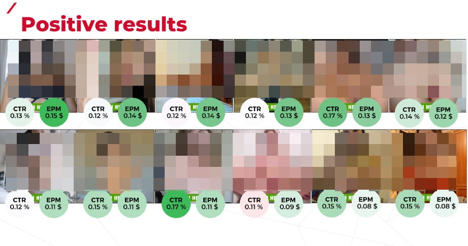
As you can see, we had quite a few positive results. Out of the 25 banners we created, only 14 made it to our next step, based on their higher CTR and EPM.
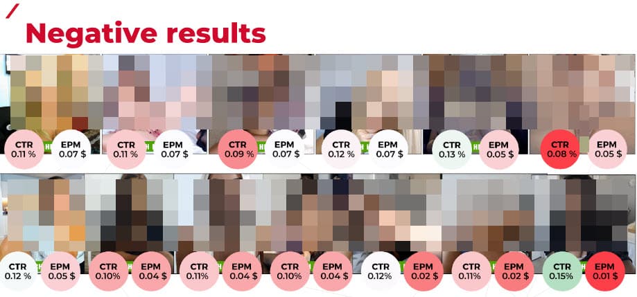
Let’s not kid ourselves; negative results are less than sexy, but they’re still very much important results one should acknowledge and never disregard throughout the testing process.
Some of the best insights come not from your successes, but your failures.
Here’s two more insights we got from the first stage:
- There’s an important correlation between high CTR and high EPM
- There’s an equally important correlation between a low CTR and low EPM
Second Stage
At this point we were ready to push for the second stage and work with another hypothesis: there’s an important variation between CTR and how camgirls are displayed (position).
We ran this test for 18 days in the United States and Australia with a 315x300 iFrame from Voluum.
Just as with the first stage, there were positive and negative results. However, we were able to gather important insights and have a better understanding of what really works with camgirls.
Our statistical model revealed a bunch of eye opening attributes that stand out. These are as follows:
- Teen
- Athletic
- Touching herself (without toys)
- Big boobs
At this point, we were on a quest to find the perfect match from MyFreeCams. We tried to find teens with big boobs (more rare than you think!). In the end, we only kept 5 camgirls whose CTR varied between 0.07% and 0.15% (US) or 0.07% and 0.26% (AU).
As a sidenote, we had to cut Australia because it was too costly for the volume of clicks. Also of note is that by phase two our return on investment (ROI) was still in the red at -66%.
Third Stage
Going into step 3, we had the following hypothesis: there’s a noticeable CTR variation between different layouts.
We tested for the United States, still using our 315x00 iFrame from Voluum on Desktop traffic. We had only 5 profiles by now for a total of 25 banners. The test ran for 11 days and ended up generating 7,518,254 impressions.
We used AdPlexity for benchmark layout and quickly noticed our hypothesis was right on the money.

Here’s some key cam insights we were able to gather from this stage:
- You won’t last 5 mins with her + Watch now was our best layout
- Jerk off with random teens was second
With that in mind, we wanted to take our winning layouts and perfect them by tweaking them by playing with colors, shapes and more.
More importantly, we came to the conclusion that layouts have a significant impact on CTR!

Fourth and Final Stage
After taking into account our new cam insights, we tweaked our banners to see which elements had the greatest impact on CTR.
There’s no hypothesis: we were merely fine-tuning our experiment.
Here’s the variants we tried for our two best layouts. When doing A/B tests, it’s important to do one change at a time to see if results are convincing — or not.
Winning Layout 1: You won’t last 5 min | Watch now
- Remove "LIVE"
- Remove the side arrows
- Remove the camgirl’s name
- Remove only the "You won’t last 5 mins" message
- Change the main color to red
- Change 5 mins to 2 mins
- Change the CTA to GO NOW
- Change the CTA to PLAY NOW
- Change the CTA to ENTER NOW
- Change the CTA to JOIN THE SHOW
- Change the CTA to JOIN NOW
Winning Layout 2: Jerk off with random teens
- Remove the arrow
- Change the shape of the arrow
- Change GO! To LIVE!
- Change colors
- Change the font size
- Change the CTA to Jerk off with that teen
- Change the CTA to Horny teens live
- Change the CTA to Test that teen
- Change the CTA to Select your girl and jerk off
- Change the CTA to Enjoy a real live show
- Add the camgirl’s name
Cam insights with MyFreeCams: drawing conclusions
All in all, we tested more than 170 banners over several weeks from premium spots. Add our landing pages into the mix and you start to get an idea of about the magnitude of data we had to toy with!
What did we learn?
- CTR correlates to EPM in a big way
- We need to work on layouts based on best practices
- We still need to test, test and test again — there’s no magic formula
- There are more popular attributes like slim/athletic, teen, amateur, etc. We must bank on them!
- We should do time-targeting
All of our tests help create better ad tools you can use to generate money online. Even though at a first glance a widget might just seem random, it really isn’t — there’s a lot going on to keep the wheels spinnin’ and create a powerful algorithm based on real data.
Do you have any cam insights you’d like to share from your own experiences? Let us know in the comments below!


