In a world where everyone wants a website but not everyone excels at design, the people who want a high-functioning responsive website deserve an “A” for effort right off the bat. Indeed, they deserve credit for knowing that Responsive design does matter and knowing it is something one should have in order to generate more sales.
Thanks to the miracle worker that is WordPress, there's a vast number of themes out there that exemplify everything that is desirable about Responsive design.
WP junkies rejoice, because here is our selection of the top responsive themes for adult blogs!
Carter

What better way to kick off a WordPress list than with a theme that makes life easy for those small-screened visitors?
We all have ‘em, and we’ve all been there, so why not cater to them?
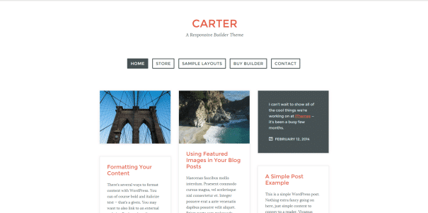
Carter is one of those instances where a beautifully simplistic design can appear just as beautiful and responsive on a mobile device as it does if you were to visit on a full-sized desktop.
Built with jQuery Masonry, the Carter WP theme gets the job done by structuring your blog posts in an attractive way while featuring built-in exchange styles and custom alternate modules. Not to mention, this theme scores points for its efficient grid layout - efficiently optimizing any leftover space on the page.
We like Carter because it's a minimalist theme and it’s fast to load. And if you remember a thing or two about minimalist designs, we love them because they showcase our content without the clutter.
Presso

This magazine oriented theme has multiple layout options and is fully customizable. You can easily replace the different elements of any page via drag & drop.
Thanks to the use of multiple breakpoints, all its columns can smoothly shrink into a single one for ultimate ease-of-navigation on smaller screens.
Speaking of navigation, Presso also offers a double menu which makes the hardlink possibilities endless here. There’s also a drop-down mega menu option that displays your content in attractive thumbnails when you mouseover … which is extra sweet if you have some nice featured images to show off.
SuperGrid

SuperGrid is another theme that's been on our radar and we have to say, it's very similar to Fashionista. This super-charged badboy makes excellent use out of an adaptive grid layout that adjusts to all screen sizes. Out of all the themes we've featured today, this one may be our favorite just for its downright incredible adaptability.
We also feel this theme may offer the highest CTR for your ads, thanks to this theme's perfectly integrated ad spots in its wildly responsive grid layout.
Affiliate Theme

And here’s the granddaddy of them all — The Affiliate Theme. This WordPress theme is perfectly suited for adult affiliate marketing. Can’t you just hear this theme calling your name?!
We strongly recommend this one if you’ve ever dabbled in promotion of health products or sex toys - or heck, even if you’re planning on it.
This whole theme was built on the 2 basic principles we’ve been trying to convey and combine over the last few weeks:
- Mobile First
- Affiliate Marketing.
When put together, this is a successful formula for effective monetization on any device.
Metro Mobile

And last but not least, let's talk about a really great 'Mobile First' theme on the market right now. If you haven’t figured it out, we’re of course talking about Metro Mobile.
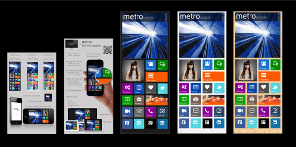
This Metro style layout will have your imagination running rampant, and your blog looking like Windows 8.
With Metro, enjoy Easy Shortcodes and a Custom Admin Panel that lets you craft Metro into the dream theme you always wanted. This modern beast lets you pick from 200 awesome icons, 13 different tile boxes, and 24 predefined colors making it an easy choice for those of you a little bit on the “hipster” side.
Don't Wait to Be Responsive
These CrakRevenue-approved picks are WordPress themes that incorporate all the key responsive points we’ve talked about in our Be Responsive! series.
Indeed, we've covered all the key elements related to Responsive design this month:
Once again, having a site display beautifully on every device is not just “a trend” — it's paramount due to the vast number of options and devices your visitors have to view your site on.
Mobile usage has seen explosive growth; don't underestimate it, ever. And if you're one to believe that mobile users don't convert as well as desktop users... just remember that these numbers continue to grow by the day and every single one of these mobile visitors remains a potential customer.
We hope that this series has inspired you to be more responsive with all your web design endeavors. Are you using a great Responsive WordPress theme that we didn't cover here? Let us know all your favorite themes in the comments!
----------------------------------------------------------------------------------------------------------------
Be Responsive! Part 1 - Mobile Thoughts
Be Responsive! Part 2 - Responsive Layouts
Be Responsive! Part 3 - Media Care
Be Responsive! Part 4 - Responsive WordPress Themes


