[ictt-tweet-blockquote]You never get a second chance to make a first impression. - Will Rogers[/ictt-tweet-blockquote]
In Marketing, first impressions are everything. It doesn’t matter what you’re actually marketing — the fact is, first impressions matter. So when it comes to your landing page — the first thing your visitors see — the devil is in the detail. Remember, your landing helps ease your user into your sales funnel, so a good landing page is not just essential, it’s crucial!
Today, we’ll explore how tweaking subtle aspects of your landing page can result in bigger payouts!
Landing Pages is what we do
If you're new to CrakRevenue, it shouldn't take you long to realize that landing pages are sort of our thing. If you’re not new and are a seasoned pro, you should know we make a lotttt of them.
We've even went over some of the basics of them and making your own -- like in How to Make a Dedicated Landing Page & Avoid the Crash.
At CrakRevenue, we design and redesign a considerable number of them to fit the specific needs of your traffic. We’ve done our homework and we’re always testing a number of approaches. That’s why whenever we add a new lander to our already extensive collection, we already know that they work. That they’re doing their job and that they convert (in our abundance of tests).
But talk is cheap without an example—and results speak! So let’s dig in, shall we?
Landers & Landers & Landers...Oh My!
When we say we design hundreds of landing pages, this statement holds especially true for Dating (at CrakRevenue, we have more than 1000 Offers in this vertical indeed).
This vertical alone requires landings out the yin-yang. In all actuality—and for all intents and purposes—there’s no better crash course guide to landing pages THAN the Dating vertical.
So with so many landers at play, you can imagine wanting the user to feel “right at home” as a feeling that’s mutual. You want your user at ease as he peeks at the door of your sales funnel.
The FapChat Lander Case Study
Here, we will use the entry point and lander of one of our exclusive offers — FapChat — as an example.
FapChat is an exclusive CrakRevenue offering that has proven to convert really, really well (especially with social traffic). We use a universal landing page to cover various GEOs across the board. Since this offer is a PPS offer and we accept so many countries with it, we’ve been known to use FapChat as one of our signature fallback landing pages.
At an attempt at increasing the conversion rate on this offer, we decided to change three specific elements on the landing page…
- the title
- the main featured image
- and the call-to-action
How do we know that these tweaks will lead to more conversions?
Because we tested them, of course!
And for this campaign, we used the Google Analytics experiments framework.
This tool allowed us to test three multiple features at the same time in the course of two weeks, instead of two weeks for each feature (but you can test up to 10 different versions of your landing page if desired).
It’s not just A/B testing here — IT’S THE WHOLE DANG ALPHABET!
In our particular case, we tried:
- 5 visuals
- 3 titles
- and 3 call-to-actions
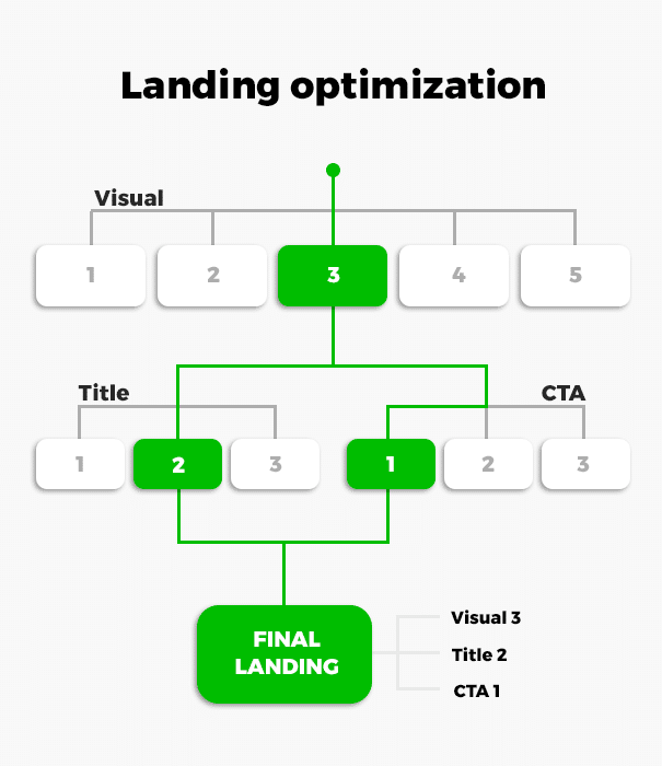
We chose only the best converting elements to create a winning landing page.
Before:
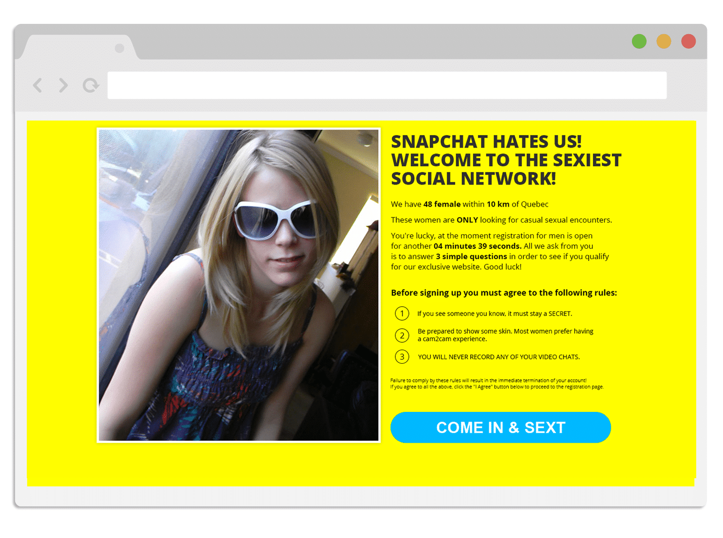
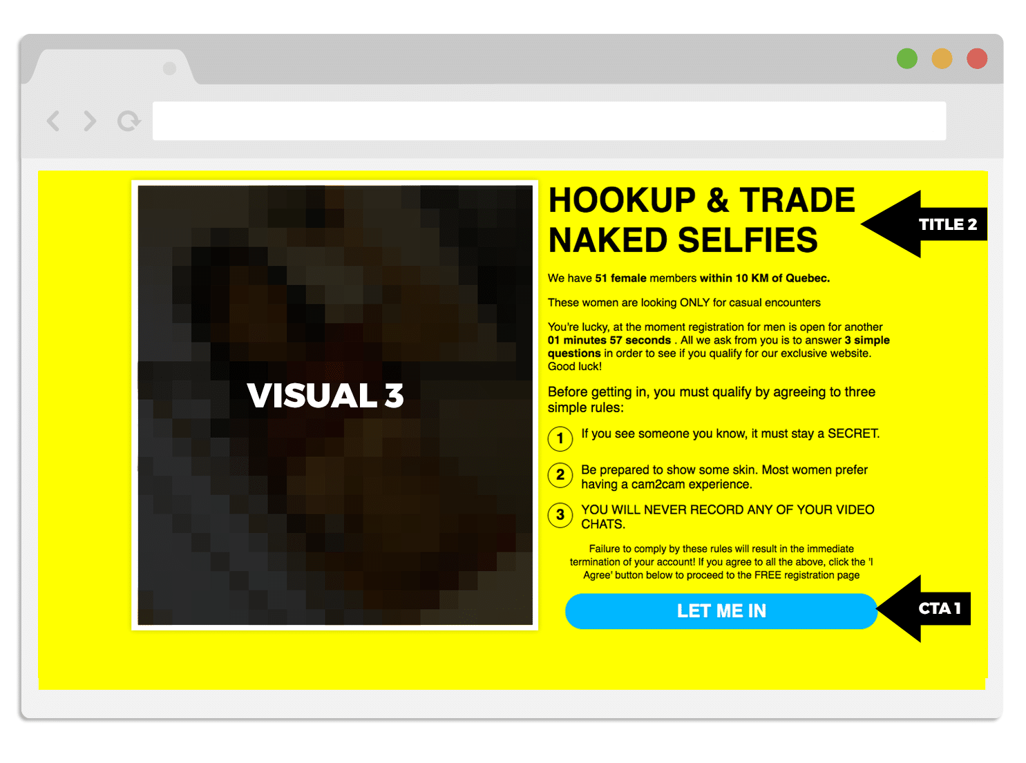
OK so that first lander already had some great elements going on. Let’s review some:
1. The Call-to-Action is in a contrasting color
The easier it is to find your CTA — the less time your user will need to spend on your landing.
- Peep Laja and Oli Gardner, from Unbounce
Honestly, your call-to-action doesn’t need to blend in or flow perfectly with your design — it just needs to be clickable. And the best way to do that is to make sure it attracts attention. Make it stand out from the rest of your landing page. In our case, we chose a blue button with a yellow background.
2. The timer
Adding a timer to your landing page creates a sense of urgency, which we know is an excellent move.
The timer becomes even more effective when you add words like “Act Now!”, “Last chance”, or “Expiring soon.” As with the contrasting button, you don’t want your user to spend too much time on your landing page… pondering which decision he or she should make...
At the end of the day, all you really need to remember is: when you increase the sense of urgency, you increase your number of conversions.
What did we change? :
The hero shot
In Dating, the featured image we choose really depends on the geo we want to target.
Since FapChat is an offer that covers a ton of eligible countries/geos, we were meticulous and mindful of meeting the following criteria:
- The girl could be from anywhere. From a tanning salon in the US, to a neighborhood in Mexico. The girl in our first landing page, for example, we felt was too pale to be universal.
- No porn stars or well-known people. The "girl next door" type works very well here. The girl should look normal, attainable, and accessible—which is essential in dating.
- The main visual shouldn’t look too professional. The quality is good but it should look like the type of image any girl herself could take with her iPhone.
Just by changing the featured image — the picture of the girl — our conversion rate on the new landing page increased by 8.20%. If this number doesn’t seem huge enough, know that more than a million people use FapChat, so 8.20% is a pretty substantial difference in the grand scheme of things.
2. The wording of the Call-to-Action
Just like with the featured image of the girl — the call-to-action needs to seduce your user.
In our tests, we tried “Skip this step”, “Come in & Sext” and “Let me in”. The first one (Skip this step) brought in the fewest number of conversions, since it was far too general & wasn’t in tune with the overall tone of the landing page.
The second one (Come in & Sext) worked better, but with Dating, crude words like ‘’Sex’’ and ‘’Fuck’’ convert a little less, believe it or not, than more discreet but still inviting words.
In these tests, ‘’Let me in’’ was the winner here, with an increase in conversions of 7.41%.
We didn’t change the color of the CTA nor its size, since everything else was already optimal.
3. The heading
As with the CTA, the wording of the heading should feel seducing.
At CrakRevenue, we have to stay up on trends; it’s worth noting in the Dating world, the term ‘’hookup’’ converts 6.74% more when this type of wording is used.
We also made sure to keep our titles short. A killer landing page should have a title that’s clear and concise.
It also needs to contain the fears, needs, and/or wants of your user. In this case — Hookups.
Make, test, tweak!
We encourage anyone to take a shot at creating their own landing page if they feel they can bring something new to the table that’s not in one of our existing landers. Remember, we have hundreds available. If you’re ever not sure which one to use, don’t hesitate to reach out to a member of our Support team or your Affiliate Manager.
What are your thoughts on the matter?
Are you someone that believes in creating your own lander — or are you someone that prefers to use what’s available & offered?
There’s no harm in either!
But if you are someone who likes to create your own — what has your tests taught you?
Let us know! We’re curious!

